17th October - 21st October
Monday 17th
Mondays always start with a 9am lecture by Dr Simon Bell. Todays lecture was entitled "Gutenberg and the Gothic", the lecture was very interesting and also continued from last weeks lecture. This time we managed to watch the psychedelic short film that wasn't working last week. But before i start talking about the short film, i will add the notes i gathered from the lecture.
Why Gutenberg?


After the lecture, we were asked to go into groups and we were gicentre a sheet of paper with random letters on it. Our task was to cut each one out and spellout the sentence 'The quick brown fox jumps over the lazy dog" using the 6 different fonts on the sheet. We started by putting all the letters in alphabetical order then moved on to grouping them based on their aperance, after this we moved on to spelling out the sentence. We were also told to put the letters on the line. This is how my groups one went....


Monday 17th
Mondays always start with a 9am lecture by Dr Simon Bell. Todays lecture was entitled "Gutenberg and the Gothic", the lecture was very interesting and also continued from last weeks lecture. This time we managed to watch the psychedelic short film that wasn't working last week. But before i start talking about the short film, i will add the notes i gathered from the lecture.
Why Gutenberg?
- In the middle ages there was a revolution
- New civilised society based upon independent learning or exchange of infromation
- Blossoming of professions such as medicine and law
- Gutenberg invented moveable type
- Visually sophisticated
- Gutenberg did not create printing. The original methid was cutting wood, then printing with it
- He was a goldsmith by profession
What did he achieve?
- Developed matrix for lasting letters to make them regular
- Gutenberg wanted to deliver seamlessly and profitably
- Made the bible like a gothic manuscript book
I found this lecture to be very fasinating because it opened my eyes to the history of printed typography. I find it very intersting that orginally if you wanted to print text, you would have to hand cut the text out of wood. Gutenbergs invention changed history and his process is still used today because it is so effective.
Tuesday 18th
Today was a workshop with Rob Tovey. We had a small lecture then moved onto creating our Kenzo posters. Fortunately for me i decided to creat my poster when i was given the brief. But i still developed and played with the concepts i had come up with.
Wednesday 19th
Today i had a lecture with Paula. We watched another graphic design clip. This time the designer was Jessica Hische, she is a letterer, illustrator and graphic designer. I didnt find this designer very intersting because, her work wasn't very intersting to me.
Add-Vantage module
This is lecture 3 of the module and i can still confirm that the module is nothing like the description posted online. Im still unhappy with my add-vantage scheme. Here are some of the notes i gathered from the lecture;
What is marketing?
- Old definition: satisfying customer needs.
- New definition: a satisfying customer experience
Why hire a design agencey?
- Cost efficient
- Time saving
- Professional
- Value
- Training: learn new skills as you work side by side
Thursday 20th
Today we had a guest speaker called Matt Johnsten and he presented a lecture entitled 'An ontotogical induction'. This presentation was very interesting, he went into the details and differences between a physical photography and a digital image. Here are the notes I gathered:
Photographs
- 2D
- Flattenes the world
- Has edges (usually rectangular or square)
- An artifact
- Still image
- Fixed in time
- Usally colour or monochrome
- Denotations and connections
Photography brings two worlds together (e.g: holding the sun)
Composition of light and dark helps guide the eye.
- Painters start with a blank canvas and build an image
- A photographer selects a part of the world and captures it
- Cropping an image can change the view/ feel of the photograph
- Possibly research Edward Hopper
Symbolic: symbolises
Iconic: it looks like...
Indexical: is a trace of something
We where all given the task to go off by ourselves and come back with 3 photographs with a similar theme that represent symbolism, iconic and indexical. Here are my images...


We where all given the task to go off by ourselves and come back with 3 photographs with a similar theme that represent symbolism, iconic and indexical. Here are my images...


It workshop: Illustrator
Today we learnt the basics of Adobe illustrator. We made various shapes and experimented with different buttons. After experimenting we moved on to creating a pumpkinew. Here are my notes form the class:
Vector image= no pixels
- Everything can have a fill and a stroke
- Everything has paths and points
- Pencil, brush and pen are the main tools
- It's best to save files as .eps
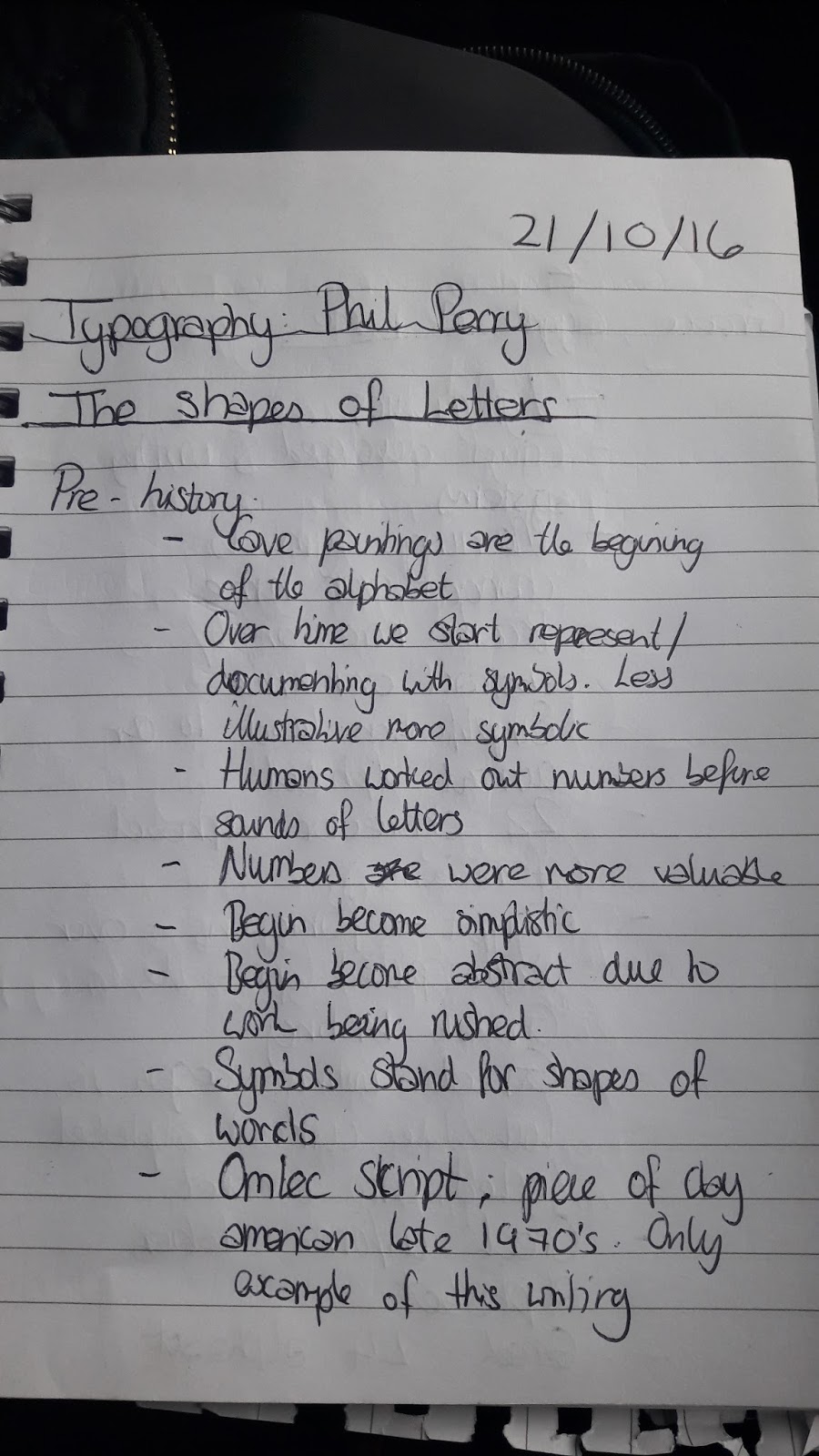
Typography: the shapes of letters
The presentation was delivered byet Phil Perry. I learnt a lot in this presentation and it's opened my eyes topen new aspects of typography. Here are some photos of the notes i gathered.


After the lecture, we were asked to go into groups and we were gicentre a sheet of paper with random letters on it. Our task was to cut each one out and spellout the sentence 'The quick brown fox jumps over the lazy dog" using the 6 different fonts on the sheet. We started by putting all the letters in alphabetical order then moved on to grouping them based on their aperance, after this we moved on to spelling out the sentence. We were also told to put the letters on the line. This is how my groups one went....

This is what ours looked like after we stuck the letters on the page.

This is what it looked like after it had been scanned. In this image you can see how straight and wacky the text is on places. This task helped me gain a better understanding about spacing and letter placement.
Comments
Post a Comment